Sunday 26 January 2014

Distributed load testing in JMeter

What is distributed load testing?
Distributed load testing is the process using which multiple systems are used for simulating load of large number of users. In JMeter this is achieved by creating a Master- Slave configuration.


Why it is required?
The reason of using more than one system for load testing is the limitation of single system to generate large number of threads (users).


What other options do we have?

Apart from using distributed load testing we can perform load testing over cloud also. Load testing on cloud (like Amazon’s EC2) has several advantages- easy scalability, no maintenance, fast deployment and no artificial network bottlenecks.
Another alternative is Blazemeter which is a cloud based service compatible with Apache JMeter. It generates large amount of instant load and provide very comprehensive reporting and analysis features.
Also, we can perform distributed load testing on cloud, in which multiple machines on cloud can be used for generating large amount of load.


Distributed Load Testing using JMeter-
For distributed load testing we need to create Master-slave configuration wherein Master will control all the slaves and collect the test results. To make the system work firewall needs to be turned off and all the systems need to be in same subnet.
Also, preferably all the systems need to use same version of JMeter and Java.


1. First of all we need to start the jmeter-server.bat in the slave systems. For this just go to the bin folder inside JMeter home directory and run the batch file jmeter-server.bat(for windows) or jmeter-server (for linux).
2. Now on the master system open the properties file jmeter.properties and edit theremote_hosts entry. Remove the loopback address’s value (127.0.0.1) for the remote_host entry and specify the IP addresses of all the slave systems separated by commas.


3. We just need to Remote start all the slave machines remotely in JMeter. For this just open JMeter on the Master machine (for which properties file is just edited). Open your test script and remote start all the nodes.


This was all about distributed load testing in JMeter.

Understanding Summary Report in Jmeter

The summary report shows values about the measurement Jmeter has done while calling the same page as if many users are calling the page. It gives the result in tabular format which you can save as .csv file.

These are some main headings in the summary result listener. Lets understand them in detail:
Summary Report


In the above image you can see in the red lined box: Label, Samples, Average, Max, Min, Std.Dev, Error%, Throughput, KB/Sec, Avg.Bytes.
  
LabelIn the label section you will able to see all the recorded http request, during test run or after test run.


SamplesSamples denote to the number of http request ran for given thread. Like we have one http request and we run it with 5 users, than the number of samples will be 5x1=5.
Same if the sample ran two times for the single user, than the number of samples for 5 users will be 5x2=10.


Average:  Average is the average response time for that particular http request. This response time is in millisecond. Like in the image you can see for first label, in which the number of sample is 4 because that sample run 2 time for single user and i ran the test with 2 user. So for 4 samples the average response time is 401 ms.


MinMin denotes to the minimum response time taken by the http request. Like for the above image the minimum response time for first four samples is 266 ms. It means one http request responded in 266 ms out of four samples.


MaxMax denotes to the maximum response time taken by the http request. Like for the above image the maximum response time for first four samples is 552 ms. It means one http request responded in 552 ms out of four samples.


Std.Deviation: This shows how many exceptional cases were found which were deviating from the average value of the receiving time.   The lesser this value more consistent the time pattern is assumed.


Error %: This denotes the error percentage in samples during run. This error can be of 404(file not found), or may be exception or any kind of error during test run will be shown in Error %. In the above image the error % is zero, because all the requests ran successfully.


ThroughputThe throughput is the number of requests per unit of time (seconds, minutes, hours) that are sent to your server during the test.


These are the main term for Summary report. Hope it will help you.

Installing Apache JMeter in Windows XP

Prerequisites for installing Apache JMeterHow to install Apache JMeter?How to start Apache JMeter?

Prerequisites for installing Apache JMeter


Apache JMeter is a utility based on Java.  We need Java runtime already installed to use Apache JMeter.  After confirming that our Windows XP system has proper Java runtime installed we can proceed for installing Apache JMeter.

For checking whether we have Java runtime installed we can follow one of the methods given here.  The second method given on that page is the easiest and that is opening a command prompt and typing the command:

java -version

If the command works Java is installed and you will also know the version of Java.

Apache JMeter runs on a fully compliant JVM 1.4 or higher. (It is found that some early versions of Java 1.5 below update 7 do not recognize some JVM switches and hence the jmeter.bat script file needs some changes to run JMeter, described at the end of post).

Steps for installing Apache JMeter

The Apache JMeter Home page contains links for downloads.  When we visit Apache JMeter home page the Apache Jakarta project symbol of a bird feather can be seen with introduction to JMeter. 


As shown in the image below we have to select the Download Releases link from the home page.

The download page presents many options for download.  Usually the suggested mirror is the best mirror but we can choose another one if the suggested mirror gives error or seems slow.  For just using the tool we need only the binary release.  The screen below shows the version current at the time of writing this article.  The TGZ version of the binary is relatively smallest in size.  Click on that link and save the download when prompted by the browser.

Alternatively you can click on the ZIP version given below and use any standard UNZIP utility to extract the files.

I have saved the TGZ file and extracted the contents by using 7Zip utility for windows.  After extracting the TGZ file we get a folder named jakarta-jmeter-n.n.n, where n.n.n is the version number which we downloaded.

The executable script for Apache JMeter is located in the bin directory.

The screen below shows all the contents of the jmeter bin folder.

Starting Apache JMeter tool


The executable script for Windows platform is jmeter.bat for Linux systems it will be jmeter.sh
These scripts are used to start JMeter in GUI mode.  Let us double click the jmeter.bat script to start the tool.

Double clicking the jmeter.bat file will start one command prompt and the JMeter utility in GUI mode, as shown below.  The command prompt is tied with the GUI and hence cannot be closed.  If the command prompt is closed the GUI will terminate.  We can keep the command prompt minimized while working with JMeter GUI.  The command prompt is useful in viewing any JMeter exceptions that may occur.

We saw how to download, install and start the Apache JMeter utility.

NOTE: Although Apache JMeter can run on any fully compliant Java version above Java 1.4 (It is found that some early versions of Java 1.5 below update 7 do not recognize some JVM switches and hence the jmeter.bat script file needs some changes to run JMeter.  If you happen to have early Java 1.5 version below update 7 then you may get error when double clicking the jmeter.bat file.  The error can be fixed by commenting line "set DUMP=-XX:+HeapDumpOnOutOfMemoryError" in the jmeter.bat file.  Open the jmeter.bat file by right clicking and choosing Edit option.  add REM before that line and you are ready to go.

Reference:
1) http://jakarta.apache.org/jmeter/usermanual/get-started.html#install

Thanks for reading.

Plotting your load test with JMeter


If you've ever used JMeter, you know it's an awesome load testing tool. It also comes with a built-in graph listener, which allows you to watch JMeter do, well... something.

JMeter graph
While this gives a basic view of response time and throughput, it doesn't show failures, nor how the server responds as load increases. And let's face it, it's just plain ugly.
Enter Matplotlib, a beautiful (though complex) plotting tool written in Python.
Box plots for response time are shown in green, throughput is in blue, and 50x errors are plotted as red X's. The script assumes a few things:
  • You have a series of CSV files sampled with different thread counts.
  • The input files are named N-blah-blah.csv, where N is the number of threads. The file names are taken as command-line arguments.
  • Your CSV report contains the follow fields at a minimum: label, elapsed, and timeStamp. The results are grouped by label (a name you assign to each JMeter sampler), so each sampler produces a separate plot.
  • And of course, that you have python and Matplotlib. If you are on OS X, the easiest way to install it is via MacPorts.
Stay tuned for the next article on the JMX file.

Sample plots

Click an image for a larger view.

Source code

#!/opt/local/bin/python2.6
 
from pylab import *
import numpy as na
import matplotlib.font_manager
import csv
import sys
 
elapsed = {}
timestamps = {}
starttimes = {}
errors = {}
 
# Parse the CSV files
for file in sys.argv[1:]:
  threads = int(file.split('-')[0])
  for row in csv.DictReader(open(file)):
    if (not row['label'] in elapsed):
      elapsed[row['label']] = {}
      timestamps[row['label']] = {}
      starttimes[row['label']] = {}
      errors[row['label']] = {}
    if (not threads in elapsed[row['label']]):
      elapsed[row['label']][threads] = []
      timestamps[row['label']][threads] = []
      starttimes[row['label']][threads] = []
      errors[row['label']][threads] = []
    elapsed[row['label']][threads].append(int(row['elapsed']))
    timestamps[row['label']][threads].append(int(row['timeStamp']))
    starttimes[row['label']][threads].append(int(row['timeStamp']) - int(row['elapsed']))
    if (row['success'] != 'true'):
      errors[row['label']][threads].append(int(row['elapsed']))
 
# Draw a separate figure for each label found in the results.
for label in elapsed:
  # Transform the lists for plotting
  plot_data = []
  throughput_data = [None]
  error_x = []
  error_y = []
  plot_labels = []
  column = 1
  for thread_count in sort(elapsed[label].keys()):
    plot_data.append(elapsed[label][thread_count])
    plot_labels.append(thread_count)
    test_start = min(starttimes[label][thread_count])
    test_end = max(timestamps[label][thread_count])
    test_length = (test_end - test_start) / 1000
    num_requests = len(timestamps[label][thread_count]) - len(errors[label][thread_count])
    if (test_length > 0):
      throughput_data.append(num_requests / float(test_length))
    else:
      throughput_data.append(0)
    for error in errors[label][thread_count]:
      error_x.append(column)
      error_y.append(error)
    column += 1
 
 
  # Start a new figure
  fig = figure(figsize=(9, 6))
 
  # Pick some colors
  palegreen = matplotlib.colors.colorConverter.to_rgb('#8CFF6F')
  paleblue = matplotlib.colors.colorConverter.to_rgb('#708DFF')
 
  # Plot response time
  ax1 = fig.add_subplot(111)
  ax1.set_yscale('log')
  bp = boxplot(plot_data, notch=0, sym='+', vert=1, whis=1.5)
 
  # Tweak colors on the boxplot
  plt.setp(bp['boxes'], color='g')
  plt.setp(bp['whiskers'], color='g')
  plt.setp(bp['medians'], color='black')
  plt.setp(bp['fliers'], color=palegreen, marker='+')
 
  # Now fill the boxes with desired colors
  numBoxes = len(plot_data)
  medians = range(numBoxes)
  for i in range(numBoxes):
    box = bp['boxes'][i]
    boxX = []
    boxY = []
    for j in range(5):
      boxX.append(box.get_xdata()[j])
      boxY.append(box.get_ydata()[j])
    boxCoords = zip(boxX,boxY)
    boxPolygon = Polygon(boxCoords, facecolor=palegreen)
    ax1.add_patch(boxPolygon)
 
  # Plot the errors
  if (len(error_x) > 0):
    ax1.scatter(error_x, error_y, color='r', marker='x', zorder=3)
 
  # Plot throughput
  ax2 = ax1.twinx()
  ax2.plot(throughput_data, 'o-', color=paleblue, linewidth=2, markersize=8)
 
  # Label the axis
  ax1.set_title(label)
  ax1.set_xlabel('Number of concurrent requests')
  ax2.set_ylabel('Requests per second')
  ax1.set_ylabel('Milliseconds')
  ax1.set_xticks(range(1, len(plot_labels) + 1, 2))
  ax1.set_xticklabels(plot_labels[0::2])
  fig.subplots_adjust(top=0.9, bottom=0.15, right=0.85, left=0.15)
 
  # Turn off scientific notation for Y axis
  ax1.yaxis.set_major_formatter(ScalarFormatter(False))
 
  # Set the lower y limit to the match the first column
  ax1.set_ylim(ymin=bp['boxes'][0].get_ydata()[0])
 
  # Draw some tick lines
  ax1.yaxis.grid(True, linestyle='-', which='major', color='grey')
  ax1.yaxis.grid(True, linestyle='-', which='minor', color='lightgrey')
  # Hide these grid behind plot objects
  ax1.set_axisbelow(True)
 
  # Add a legend
  line1 = Line2D([], [], marker='s', color=palegreen, markersize=10, linewidth=0)
  line2 = Line2D([], [], marker='o', color=paleblue, markersize=8, linewidth=2)
  line3 = Line2D([], [], marker='x', color='r', linewidth=0, markeredgewidth=2)
  prop = matplotlib.font_manager.FontProperties(size='small')
  figlegend((line1, line2, line3), ('Response Time', 'Throughput', 'Failures (50x)'),
    'lower center', prop=prop, ncol=3)
 
  # Write the PNG file
  savefig(label)

JMeter Graphs analysis


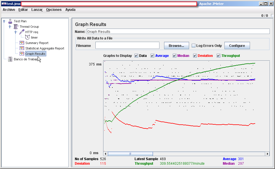
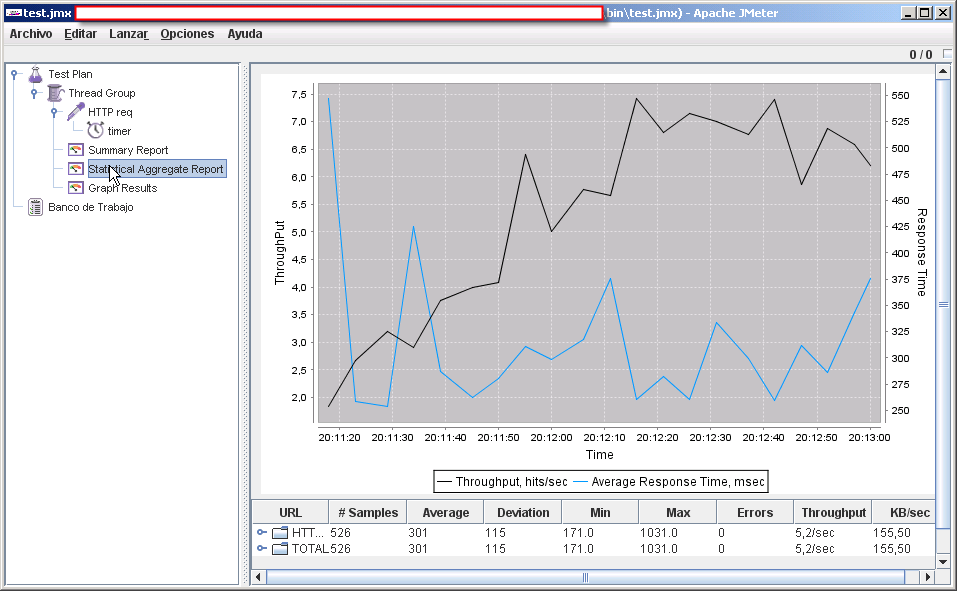
If you are tired of the old “Graph Results” listener that JMeter provides and want better charts in your Jmeter test plan take a look at this JMeter plugin.

This is how the old “Graph Results” look like:


Click on the above image or here to see an enlarged version of the old Graph Results


this new JMeter plugin that provides a new Statistical Aggregate Report listener. (see the screenshot)

Why Averages Suck and Percentiles are Great

Anyone that ever monitored or analyzed an application uses or has used averages. They are simple to understand and calculate. We tend to ignore just how wrong the picture is that averages paint of the world. To emphasis the point let me give you a real world example outside of the performance space that I read recently in a newspaper.
The article was explaining that the average salary in a certain region in Europe was 1900 Euro’s (to be clear this would be quite good in that region!). However when looking closer they found out that the majority, namely 9 out of 10 people, only earned around 1000 Euros and one would earn 10.000 (I over simplified this of course, but you get the idea). If you do the math you will see that the average of this is indeed 1900, but we can all agree that this does not represent the “average” salary as we would use the word in day to day live. So now let’s apply this thinking to application performance.

The Average Response Time

The average response time is by far the most commonly used metric in application performance management. We assume that this represents a “normal” transaction, however this would only be true if the response time is always the same (all transaction run at equal speed) or the response time distribution is roughly bell curved.
A Bell curve represents the "normal" distribution of response times in which the average and the median are the same. I rarely ever occurs in real applications
A Bell curve represents the “normal” distribution of response times in which the average and the median are the same. I rarely ever occurs in real applications
In a Bell Curve the average (mean) and median are the same. In other words observed performance would represent the majority (half or more than half) of the transactions.
In reality most applications have few very heavy outliers; a statistician would say that the curve has a long tail. A long tail does not imply many slow transactions, but few that are magnitudes slower than the norm.
This is a typical Response Time Distribution with few but heavy outliers - it has a long tail
This is a typical Response Time Distribution with few but heavy outliers – it has a long tail. The average here is dragged to the right by the long tail.
We recognize that the average no longer represents the bulk of the transactions but can be a lot higher than the median.
You can now argue that this is not a problem as long as the average doesn’t look better than the median. I would disagree, but let’s look at another real-world scenario experienced by many of our customers:
This is another typical Response Time Distribution. Here we have quite a few very fast transactions that drag the average to the left of the actual median
In this case a considerable percentage of transactions are very, very fast (10-20 percent), while the bulk of transactions are several times slower. The median would still tell us the true story, but the average all of a sudden looks a lot faster than most of our transactions actually are. This is very typical in search engines or when caches are involved, some transactions are very fast, but the bulk are normal. Another reason for this scenario are failed transactions, more specifically transactions that failed fast. Many real world applications have a failure rate of 1-10 percent (due to user errors or validation errors). These failed transactions are often magnitudes faster than the real ones and consequently distorted an average.
Of course performance analysts are not stupid and regularly try to compensate with higher frequency charts (compensating by looking at smaller aggregates visually) and by taking in minimum and maximum observed response times. However we can often only do this if we know the application very well, those unfamiliar with the application might easily misinterpret the charts. Because of the depth and type of knowledge required for this, it’s difficult to communicate your analysis to other people – think how many arguments between IT teams have been caused by this. And that’s before we even being to think about communicating with business stakeholders!
A better metric by far are percentiles, because they allow us to understand the distribution. But before we look at percentiles, let’s take a look a key feature in every production monitoring solution: Automatic Baselining and Alerting.

Automatic Baselining and Alerting

In real world environments, performance gets attention when it is poor and has a negative impact on the business and users. But how can we identify performance issues quickly to prevent negative effects? We cannot alert on every slow transaction, since there are always some. In addition, most Operations teams have to maintain a large number of applications are not familiar with all of them, so manually setting thresholds can be inaccurate, quite painful and time consuming.
The industry has come up with a solution called Automatic Baselining. Baselining calculates out the “normal” performance and only alerts us when an application slows down or produces more errors than usual. Most approaches rely on averages and standard deviations.
Without going into statistical details, this approach again assumes that the response times are distributed over a bell curve:
The Standard Deviation represents 33% of all transactions with the mean as the middle. 2xStandard Deviation represents 66% and thus the majority, everything outside could be considered an outlier.
The Standard Deviation represents 33% of all transactions with the mean as the middle. 2xStandard Deviation represents 66% and thus the majority, everything outside could be considered an outlier. However most real world scenarios are not bell curved…
Typically, transactions that are outside 2 times standard deviation are treated as slow and captured for analysis. An alert is raised if the average moves significantly. In a bell curve this would account for the slowest 16.5 percent (and you can of course adjust that), however if the response time distribution does not represent a bell curve it becomes inaccurate. We either end up with a lot of false positives (transactions that are a lot slower than the average but when looking at the curve lie within the norm) or we miss a lot of problems (false negatives). In addition if the curve is not a bell curve than the average can differ a lot from the median, applying a standard deviation to such an average can lead to quite a different result than you would expect! To work around this problem these algorithms have many tunable variables and a lot of “hacks” for specific use cases.

Why I love percentiles

A percentile tells me at which part of the curve I am looking at and how many transactions are represented by that metric. To visualize this look at the following chart:
This chart shows the 50th and 90th percentile along with the average of the same transaction. It shows that the average is influenced far mor heavily by the 90th, thus by outliers and not by the bulk of the transactions
The green line represents the average. As you can see it is very volatile. The other two lines represent the 50th and 90th percentile. As we can see the 50th percentile (or median)  is rather stable but has a couple of jumps. These jumps represent real performance degradation for the majority (50%) of the transactions. The 90th percentile (this is the start of the “tail”) is a lot more volatile, which means that the outliers slowness depends on data or user behavior. What’s important here is that the average is heavily influenced (dragged) by the 90th percentile, the tail, rather than the bulk of the transactions.
If the 50th percentile (median) of a response time is 500ms that means that 50% of my transactions are either as fast or faster than 500ms. If the 90th percentile of the same transaction is at 1000ms it means that 90% are as fast or faster and only 10% are slower. The average in this case could either be lower than 500ms (on a heavy front curve), a lot higher (long tail) or somewhere in between. A percentile gives me a much better sense of my real world performance, because it shows me a slice of my response time curve.
For exactly that reason percentiles are perfect for automatic baselining. If the 50th percentile moves from 500ms to 600ms I know that 50% of my transactions suffered a 20% performance degradation. You need to react to that.
In many cases we see that the 75th or 90th percentile does not change at all in such a scenario. This means the slow transactions didn’t get any slower, only the normal ones did. Depending on how long your tail is the average might not have moved at all in such a scenario!
In other cases we see the 98th percentile degrading from 1s to 1.5 seconds while the 95th is stable at 900ms. This means that your application as a whole is stable, but a few outliers got worse, nothing to worry about immediately. Percentile-based alerts do not suffer from false positives, are a lot less volatile and don’t miss any important performance degradations! Consequently a baselining approach that uses percentiles does not require a lot of tuning variables to work effectively.
The screenshot below shows the Median (50th Percentile) for a particular transaction jumping from about 50ms to about 500ms and triggering an alert as it is significantly above the calculated baseline (green line). The chart labeled “Slow Response Time” on the other hand shows the 90thpercentile for the same transaction. These “outliers” also show an increase in response time but not significant enough to trigger an alert.
Here we see an automatic baselining dashboard with a violation at the 50th percentile.
Here we see an automatic baselining dashboard with a violation at the 50th percentile. The violation is quite clear, at the same time the 90th percentile (right upper chart) does not violate. Because the outliers are so much slower than the bulk of the transaction an average would have been influenced by them and would not have have reacted quite as dramatically as the 50th percentile. We might have missed this clear violation!

How can we use percentiles for tuning?

Percentiles are also great for tuning, and giving your optimizations a particular goal. Let’s say that something within my application is too slow in general and I need to make it faster. In this case I want to focus on bringing down the 90th percentile. This would ensure sure that the overall response time of the application goes down. In other cases I have unacceptably long outliers I want to focus on bringing down response time for transactions beyond the 98th or 99th percentile (only outliers). We see a lot of applications that have perfectly acceptable performance for the 90th percentile, with the 98th percentile being magnitudes worse.
In throughput oriented applications on the other hand I would want to make the majority of my transactions very fast, while accepting that an optimization makes a few outliers slower. I might therefore make sure that the 75th percentile goes down while trying to keep the 90th percentile stable or not getting a lot worse.
I could not make the same kind of observations with averages, minimum and maximum, but with percentiles they are very easy indeed.

Conclusion

Averages are ineffective because they are too simplistic and one-dimensional. Percentiles are a really great and easy way of understanding the real performance characteristics of your application. They also provide a great basis for automatic baselining, behavioural learning and optimizing your application with a proper focus. In short, percentiles are great!

Friday 24 January 2014

Checking for empty variable using IF controller

Sometimes you need to add HTTP samplers with dynamic URL or with dynamic part of the URL which are stored in some variable after HTTP sampler post-processing.


But if Regular Expression Extractor will not find any matching string result variable will be set to default value (empty value in our case). We should test this variable for emptyness before we will use it.

Now if the News page has not any news we are sure that JMeter will handle this situation correctly.